
Checkpoint
While looking through reference linked through previous post to see what type of data I am interested in. I settled on using Conniticuit school attendance rates because I recognized a trend and thought of a possible scenario.
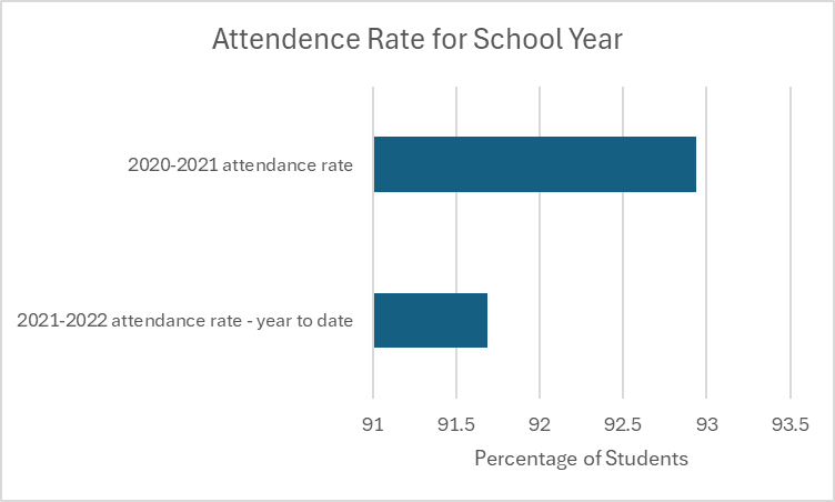
Trends?
While looking at this graph you can see a large difference between the 2 school years. It is important to look at the percentages because the numbers are not far apart. There is a little over 1% decrease between 20-21 school year to the 21-22 school year. I looked at other variables documented in the data set from Data.Gov. I identified a couple possible reasons on why the attendance rate went down. There is an increase in students with disabilities and students that are homeless in 21-22 school year. This could be a possible explanation to why the attendance rate drops. I used excel to complete everything attached below.
Excel
I pulled all the data into an excel sheet once I got it off of Data.gov. I deleted a couple rows that didn’t have any bearing on the results. I cleaned the data and put it into the table. Once we completed that I pulled the percentages I wanted to graph and created that and added the proper axis titles. After this I used 2 different pivot tables to extract the data I wanted to find the answer to the lowering number.
Leave a Reply